Bootstrap5で入れ子モーダルを実現する
Bootstrap5では公式にサポートされていない入れ子モーダルを作る
ウェブアプリにおいて、ユーザーからの操作や情報入力を段階的に進めるために、複数のモーダルを重ねて表示したいケースがしばしば存在する。
しかし Bootstrap5 では標準のモーダル機能として入れ子モーダルをサポートしていない。
公式でもUXの関係でサポートしていないと明示されており、モーダルから別のモーダルを呼び出すことは可能だが、元のモーダルは消えてしまう。
なぜ消えるか
通常、Bootstrap5のモーダルはdata属性を用いて展開する。
<button class="btn btn-primary" data-bs-target="#modalA" data-bs-toggle="modal">
  Open second modal
</button>
このとき、bootstrap.js で呼ばれる処理の中に、すでに開いているモーダルがある場合は閉じる処理が入っているため、展開中のものは閉じられてしまう。
// avoid conflict when clicking modal toggler while another one is open
const alreadyOpen = SelectorEngine.findOne(OPEN_SELECTOR)
if (alreadyOpen) {
  Modal.getInstance(alreadyOpen).hide()
}

const data = Modal.getOrCreateInstance(target)

data.toggle(this)
そのため、data属性を用いたモーダル展開を使うことはできない。
解決策
代わりにモーダルインスタンスの show() メソッドを使う。
show() には上述の処理は含まれてないため複数のモーダルを同時に表示できる。
あとはモーダルと背景となる backdrop の z-index を調整してうまく層を作ればいい。
サンプル
以下は jQuery でモーダルの表示トリガーを監視し、モーダルの z-index と backdrop を管理することで入れ子モーダルを実装している。
js
$(function () {
  $(document).on('click', '.show-modal', function () {
    const nextId = $(this).data('show-modal')
    if (nextId) showModal(nextId)
  })

  function showModal(modalId) {
    const newModal = $('#' + modalId)
    const modalInstance = new bootstrap.Modal(newModal[0])
    modalInstance.show()

    _setupModalZIndex(newModal)
    _setupBackdrop(modalId)
    _cleanupModal(newModal, modalId)
  }

  /**
   * モーダルのz-indexを設定する
   * z-index = 1040 + 10 * 表示中のモーダル数(Bootstrap標準の重なり順に準拠)
   * ex: 1段目: 1040, 2段目: 1050, 3段目: 1060, ...
   */
  function _setupModalZIndex(modal) {
    modal.one('shown.bs.modal', function () {
      const modalCount = $('.modal.show').length
      const zIndex = 1040 + 10 * modalCount
      modal.css('z-index', zIndex)
      modal.data('zIndex', zIndex) // backdropで使うために保存しておく
    })
  }

  /**
   * モーダルbackdropのz-indexを調整する
   * ex: 1段目: 1039, 2段目: 1049, 3段目: 1059, ...
   */
  function _setupBackdrop(modalId) {
    // z-index の設定は shown.bs.modal の後でないと正しい数にならない
    $('#' + modalId).one('shown.bs.modal', function () {
      const modal = $(this)
      const zIndex = modal.data('zIndex')

      const backdrop = $('.modal-backdrop').not('.modal-stack').last()

      backdrop
        .css('z-index', zIndex - 1) // モーダルより1つ下に配置
        .addClass('modal-stack')
        .attr('data-backdrop-for', modalId) // 削除処理のためにモーダルIDで関連付け
    })
  }

  /**
   * モーダルが閉じられたとき(hidden.bs.modal)に、対応するbackdropを削除し、
   * フォーカスを親モーダルかbodyへ逃がす
   */
  function _cleanupModal(modal, modalId) {
    modal.one('hidden.bs.modal', () => {
      $(`.modal-backdrop[data-backdrop-for="${modalId}"]`).remove()

      const openModals = $('.modal.show')
      if (openModals.length > 0) {
        // 親モーダルにフォーカスを当てる
        const lastModal = openModals.last()
        const focusTarget = lastModal
          .find('[autofocus], .btn-close, .btn, input, select')
          .first()
        if (focusTarget.length) focusTarget.trigger('focus')
      } else {
        // 最後のモーダルを閉じた場合、bodyにフォーカスを逃がす(アクセシビリティ対策)
        $(document.activeElement).trigger('blur')
        $('body').trigger('focus')
      }
    })
  }
})
html
<link
href="https://cdn.jsdelivr.net/npm/[email protected]/dist/css/bootstrap.min.css"
rel="stylesheet"
/>
<script src="https://code.jquery.com/jquery-3.7.1.min.js"></script>
<script src="https://cdn.jsdelivr.net/npm/[email protected]/dist/js/bootstrap.bundle.min.js"></script>
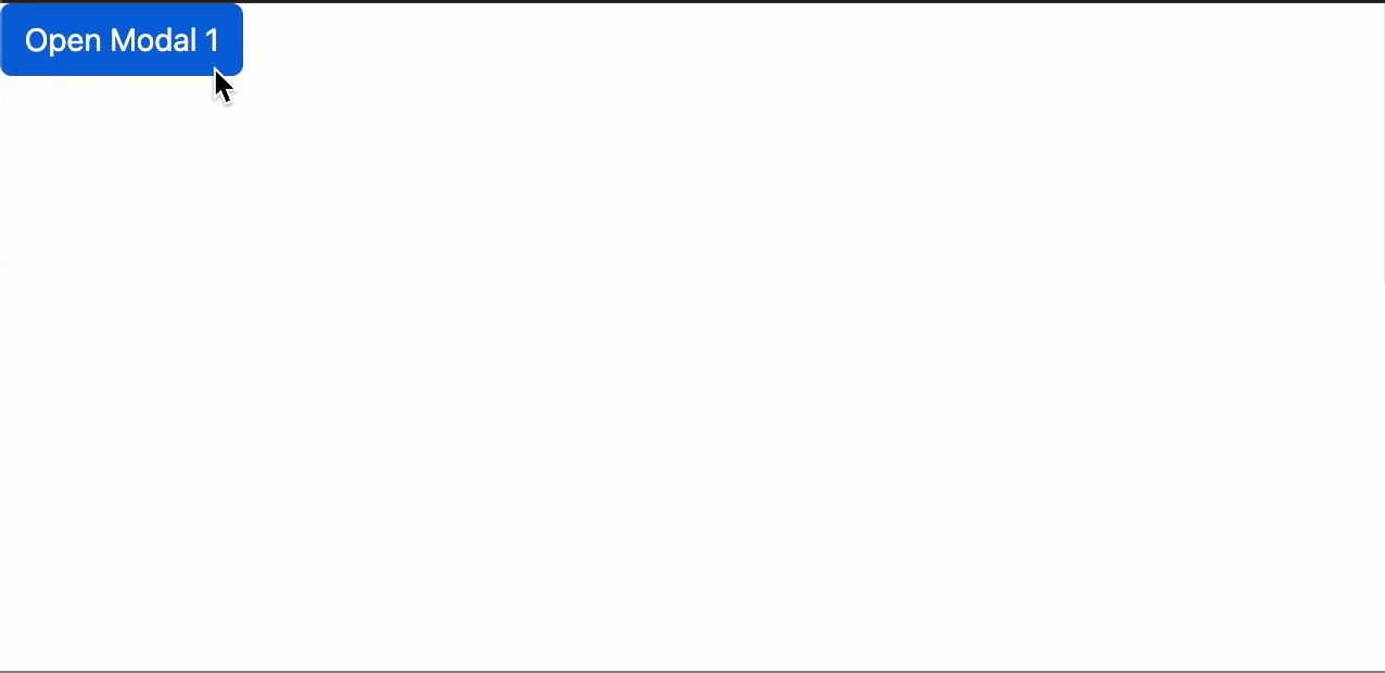
<button class="btn btn-primary show-modal" data-show-modal="modal1">
Open Modal 1
</button>
<!-- モーダル1 -->
<div class="modal" id="modal1" tabindex="-1">
<div class="modal-dialog">
<div class="modal-content">
<div class="modal-header">
<h5 class="modal-title">Modal 1</h5>
<button
type="button"
class="btn-close"
data-bs-dismiss="modal"
></button>
</div>
<div class="modal-body">
<button class="btn btn-secondary show-modal" data-show-modal="modal2">
Open Modal 2
</button>
</div>
</div>
</div>
</div>
<!-- モーダル2 -->
<div class="modal" id="modal2" tabindex="-1">
<div class="modal-dialog">
<div class="modal-content">
<div class="modal-header">
<h5 class="modal-title">Modal 2</h5>
<button
type="button"
class="btn-close"
data-bs-dismiss="modal"
></button>
</div>
<div class="modal-body">
<button class="btn btn-secondary show-modal" data-show-modal="modal3">
Open Modal 3
</button>
</div>
</div>
</div>
</div>
<!-- モーダル3 -->
<div class="modal" id="modal3" tabindex="-1">
<div class="modal-dialog">
<div class="modal-content">
<div class="modal-header">
<h5 class="modal-title">Modal 3</h5>
<button
type="button"
class="btn-close"
data-bs-dismiss="modal"
></button>
</div>
<div class="modal-body">
<button class="btn btn-secondary show-modal" data-show-modal="modal4">
Open Modal 4
</button>
</div>
</div>
</div>
</div>
<!-- モーダル4 -->
<div class="modal" id="modal4" tabindex="-1">
<div class="modal-dialog">
<div class="modal-content">
<div class="modal-header">
<h5 class="modal-title">Modal 4</h5>
<button
type="button"
class="btn-close"
data-bs-dismiss="modal"
></button>
</div>
<div class="modal-body">
<button class="btn btn-secondary show-modal" data-show-modal="modal5">
Open Modal 5
</button>
</div>
</div>
</div>
</div>
<!-- モーダル5 -->
<div class="modal" id="modal5" tabindex="-1">
<div class="modal-dialog">
<div class="modal-content">
<div class="modal-header">
<h5 class="modal-title">Modal 5</h5>
<button
type="button"
class="btn-close"
data-bs-dismiss="modal"
></button>
</div>
<div class="modal-body">
<p>Last modal (5)</p>
</div>
</div>
</div>
</div>
モーダルからモーダルを開くたび、モーダルと backdrop の z-index を調整することで層を形成している。
      _______________
     /               /   Modal 4
    / z-index:1070  /
   /_______________/
------ -index:1069 ----- Backdrop 4


      _______________
     /               /   Modal 3
    / z-index:1060  /
   /_______________/
----- z-index:1059 ----- Backdrop 3


      _______________
     /               /    Modal 2
    / z-index:1050  /
   /_______________/
------ z-index:1049 ----- Backdrop 2


      _______________
     /               /    Modal 1
    / z-index:1040  /
   /_______________/
------ z-index:1039 ----- Backdrop 1
モーダルを呼び出すボタンには
show-modalクラスdata-show-modal="モーダルのID"
をつける。 モーダル自体は通常の定義と変わらないため、使い心地にも違和感はない。
<button class="btn show-modal" data-show-modal="modal1">Open Modal 1</button>
デモ
<video class="rounded-xl border border-white/10" autoplay muted loop playsinline controls